|
|||||||
| Map Making Discuss everything related to creating new levels here. |
 |
|
|
Thread Tools | Display Modes |
|
#1
 06-24-2010, 08:14 AM
|
|||
|
|||
|
Pig said I should finish a map... and I agree. So it's time to take a trip to...
SKULL ISLAND  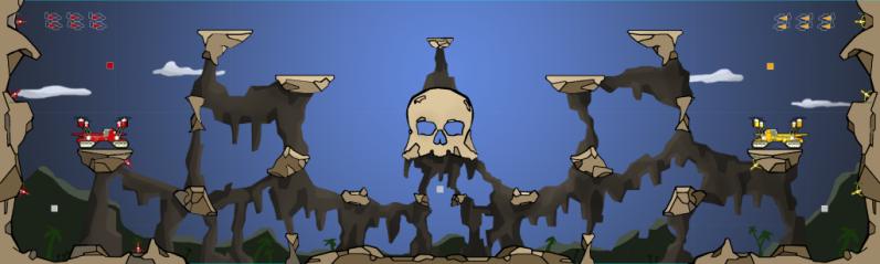 UPDATE 3: - A total rework of the game play here. I made all rocks smaller, including the skull, and repositioned all the game elements. - Rework of the structural background and the backdrop - I'm learning to do clouds like the middleground map, which I love  - There's more than a few things to tweak graphically, but it's at the point where I want to get the gameplay changes tested. Comments welcome and appreciated, as always. DOWNLOAD UPDATE 3: New Version -> http://www.mediafire.com/file/23dql2..._island_2.altx --------------------------------------------Update History----------------------------------------- Once again, an extension of an earlier map (Mesa). Now with more bombing avenues and skulls and fog. I learned A LOT about making maps on this one. Which means future maps will suck less. Plus I convinced my wife to get me one of those drawing tablets. Score! Comments/critique welcome and appreciated. UPDATE 1: Added more dimensions to the the rock structures Raised the Skull and made one of the other rock formations smaller made wrap around bombing route easier (more space) Re-drew the cave background (darker less saturated, more rock dimensions) Added a gradient sky and mountains to background Added skull-faced moon Added treeline I'm currently downloading backgrounds from other maps to see how they are done. Mine seems to cause the whole map to drag, which is why I left it out in the first place. UPDATE 2: -Added a shadow layer. (that's a lot of foreground images for a very subtle effect, but it's not affecting my screen rendering, so...) -Added lighting effects to make the area near the moon brighter, and areas further away/covered by geography darker. -Fixed some vines hanging in mid air -Added stars and a cloud in front of the moon -Made the mountain and treeline one image so there's only one image instead of two UPDATE: BALL MODE I threw this together real quick; no Bells and Whistles; A FEW GRAPHICAL GLITCHES, but I'm just testing it for now. The biggest change is the fly-through Skull, which graphically I didn't want to do, but for game play, I think it had to happen. The goals are obviously being held aloft by the magic of skull Island... Fixed Graphical Glitches in Ball mode UPDATE:Here it is: http://www.mediafire.com/file/thq2ny...ullisland.altx Last edited by Blind Pilot; 07-12-2010 at 02:02 AM. 
|
|
#3
06-24-2010, 08:33 AM
|
|||
|
|||
|
I think the value in the low route would come in wrap-around bomb drops. Regardless, very nice looking map, good job!
|
|
#5
06-24-2010, 03:47 PM
|
|||
|
|||
|
add me in game: 151ccc50-77d3-4986-9dc5-5c5532ccff80
Way to get your woman to buy you things  what kind of tablet did you get? Mine is garbage, i really need a new one. what kind of tablet did you get? Mine is garbage, i really need a new one.So, excellent start on the map, lets get this one official. In my experience the key elements to creating dynamic gameplay are: - A variety of fun, interesting bomb routes. -I'm a little worried the two middle paths which will be used the most often are too easily defended, like loco. This may not be true as its much easier to fake going middle and go either high or low. - I like the low path for the reason manatee said - Creating control areas without making the map campy. - Best example is roids. There are areas that players can control and feel comfortable camping. These areas should fluctuate during the game (unlike lost city) - This is the area i think your map is going to run into trouble. Players are forced into the top area by the large skull in the middle but there are no "controlable" areas as it's so open. - The best ideas come from experimentation, don't be afraid to drastically change something just to see if it works. Now onto graphics. When you're creating your rocks you have to imagine the 3-dimensional structure of the object, thats what your doing with the different coloured planes. Some of them work better than others, I think you should try to make an equal amount of each value on each rock, rather than having one dominant colour and adding smaller areas onto it. The best one you did is on the wall behind the base imo. After you've got that sorted out you have to have a light source, lets say its the sun which is in the top middle of the map. So every plane on a rock thats pointed at the light source is going to be the lightest colour and every plane on the opposite side is going to be the darkest. See cave for excellent use of light which in that case is cast by the crystals.
|
|
#6
06-24-2010, 05:32 PM
|
|||
|
|||
|
awesome graphics/map i think it will play a bit like fallout but it is
|
|
#8
06-24-2010, 08:44 PM
|
|||
|
|||
|
Nice looking map, I especially like the foreground mist you got going on at the bottom. The cartoony graphics look good, and will probably fit well with the game graphics.
My major criticism has to do with the background - there isn't much of one. Aside from the rocky bits used as a support background for the actual map objects, all we have is blank sky and a couple of nondescript clouds. Such a background isn't without precedent (i.e. hills), but doesn't really give the map that much lasting visual appeal (e.g. hills). For example: - in the lower areas of the map, you could flesh out the background a lot with some vegetation, palm trees, etc. Considering that there are already examples of vegetation - I see vines hanging down in some areas - I think it'd benefit from some more. - You might be able to fill the skull head with treasure! :O What's a piratey-looking map without treasure? - Up top, you could simply throw in a few more clouds, but I also feel it'd be really cool if you made some Crimson Skies-style pirate airships to go along with the feel of the skull terrain, or something else. Also, more importantly, there are two areas where the graphics look unrealistic (even though we're talking about 2D cartoon graphics, I know): - The rock overhang directly above each base looks like it cannot support its own weight and should come tumbling down upon the base. - The rock formation that supports each base has a comically thin base, and it looks like the whole thing would come crashing down if you crashed a loopy into it, let alone bombed it. In either case, this could be easily fixed just by fleshing out the background-rocky effects that you already have scattered around. As for the map itself, I feel like power ups shouldn't be hanging out waaaaay in the open - thus, I think the power up in the top-middle should be moved down closer to the top of the skull.
|
|
#9
06-24-2010, 09:40 PM
|
|||
|
|||
|
Quote:
GUI.tar - Guitar >.<
|
|
#10
06-24-2010, 11:42 PM
|
|||||
|
|||||
|
Thanks to everybody for your time. This map may make it all the way to completion
Quote:
 UP THE IRONS!). UP THE IRONS!).Quote:
Quote:
Quote:
Quote:
@Silent Skies I'm getting a draft background ready- thank for the feedback. Back to GIMP!
|
|
#11
06-25-2010, 01:44 AM
|
|||
|
|||
|
keep is short and sweet.
1. needs a way better background (literally just saw above comment @ skies lol) add a small tarzan in the background! 2. could make rocks look a bit more 3D-esque like in cave, new roids, lost city! 3. raise the top rocks with flat tops to the roof (maybe add a tip to the skull like the lower rocks of the skull in a trianglesish form) 4. more of the moss/ivy stuff maybe even a black snake through the eyes!! 5. round the tip of a bit on the rocks next to the bases to make the low route a litttle bit better (all be it already reasonably good) got great potential =] nipnip Last edited by A Nipple; 06-25-2010 at 01:46 AM.
|
|
#12
06-26-2010, 06:44 PM
|
|||
|
|||
|
UPDATED (first post)
|
|
#13
06-26-2010, 07:17 PM
|
|||
|
|||
|
great job it looks so sweet! backgrounds nice fits well, tho we want a snake on the head PLEASLLEALELSLAE lol. Also what do you or anyone else for that matterthink about rounding of those rocks a little? and a bit more ivy on the rocks.
awesoem job tho look forward to giving it a try! ty =]
|
|
#17
06-27-2010, 05:08 PM
|
|||
|
|||
|
Very nice
I love how the background underneath the skull works w/ the skull shape to make it look like a gaping mouth, ready to swallow you whole.Nip's suggestion of some stars is worthwhile, but don't go overboard with it if you do decide to. The sun is still setting in your background, so only a handful of the very brightest stars would be visible to begin with. Can't tell from the screenshot if you managed to get the environmental shading in like pig suggested, i.e. the sort of shadows that would fall on planes in-game, but your update notes suggest not. Black images w/ 50%+ transparency, sitting in a foreground layer, would do the trick, and just shape them however you see fit. Considering the main light source (which I will take to be the moon, here) is not only top-mid, but also far behind (in the background) of the main map objects, the only shadows of consequence would probably more or less be contained within the spaces etched out by the rocky background structures (though slightly smaller than said structures, in some cases), which also have rocky map objects above them. Not sure what's making your background drag. I've just been making backgrounds as one solid image and updating said image to the 'sprites' database in the editor. From what I gather, if you piece together a background out of multiple different images, it might cause the drag? I dunno...
|
|
#18
06-27-2010, 05:21 PM
|
|||
|
|||
|
Quote:
Added file download Perhaps someone will upload to a server.Thanks. Last edited by Blind Pilot; 06-27-2010 at 05:27 PM.
|
|
#19
06-27-2010, 05:26 PM
|
|||
|
|||
|
Quote:
That's something I haven't done yet. It makes sense though. I'm wondering if one might gradient the shadow to transparency, or if shadows are all or none. Either way, I'll give it a try. Thanks!
|
|
#20
06-27-2010, 06:38 PM
|
|||
|
|||
|
Also, I think that the dimensions of the rocks + the shadows of each dimension merits a 2nd look, now that you've decided where the main light source is going to be.
With the cartoon graphics, my brain is basically going with the assumption that one color = one flat plane, but sometimes the shape of a single plane (and how said plane comes together w/ other planes), and the color of the plane doesn't fit together so well. At first glance it isn't a huge deal, but the more I look at certain shapes on the map I get the nagging feeling that something is out of place. Example (original on the right):  My main problem with most of the rocks is the top plane. While being a single color (suggesting single plane), the shape (for example in this one) suggests to me that this plane, while being flat, also somehow wraps around the back of the shape, thus a conflict and I get confused. To resolve this conflict, I chopped the back portion into two planes and darkened the rear one. One of the reasons I say the colors need a 2nd look is because they were originally conceived before deciding you wanted the light source as the moon. The way the rock is now, I'm more inclined to think the light source is coming from the top left, not top middle. From a single, main light source, the planes that are facing the source the most are the brightest (here, the top) and the planes that face it the least should be darkest. In your original, the shape suggests this to me: the top plane faces the light source the most, and the other largest plane (which makes up most of the shape) is directly facing us. The third shape wedged between these two shapes (located towards the top right) would suggest that this were a transition plane - not directly facing us, but at the same time not facing the light source as directly as the top plane. For the coloring between these three, my brain would assume the top plane would be brightest, the plane facing us darkest, and the brightness of the 'transition plane' to be somewhere in between (as I set up on the left). Instead, the transition plane is the darkest. This sort of coloring suggests instead that what I originally thought to be a transition plane is instead a groove in the rock, physically deeper than the other two planes and thus receiving far less light. That's not to say a shape like that wouldn't work, but I kinda feel you'd need more complex shadows, and even more planes, to suggest that. I treated the little triangle in the mid-bottom as just such a groove, because it can't function as a 'transition plane' - enclosed on all sides by a single plane/shape, there's nothing to transition between. The little shape bottom-left would be receiving the least light of all, so I made it the darkest. Another big example of this is the rocky outcropping hanging over the bases. The shape of the top plane suggests that it wraps around towards the back and faces us as well, but it's all the same shade of color and my brain doesn't know how to resolve this inherent conflict. Sorry, I blah-blah too much. It's all up to you in the end, I'm just giving my 2 cents. EDIT: Though, thinking about it some more, it's possible that the top of the rock is on a completely flat surface, and thus pretty much invisible to us. In that case, things are a bit different I guess. Depends on what you're going for. Either way, the I still think the colors could use a once-over. Last edited by silent skies; 06-28-2010 at 12:40 AM.
|
|
#23
06-29-2010, 03:32 PM
|
|||
|
|||
|
Quote:
Quote:
2. Do you mean you don't like the idea of them, or are you saying they don't look good like hanging vines should? Note: UPDATED MAP & Screenshot - FIRST POST Last edited by Blind Pilot; 06-29-2010 at 04:01 PM.
|
|
#25
06-29-2010, 04:28 PM
|
|||
|
|||
|
Quote:
But coming to think of it, maybe this background is more in sync with the theme, before this background, the map had a more happy feeling to it. Last edited by mlopes; 06-29-2010 at 04:33 PM.
|
|
#26
06-29-2010, 04:37 PM
|
|||
|
|||
|
Quote:

|
|
#28
06-29-2010, 05:06 PM
|
|||
|
|||
|
also you could add a litttle mroe detail and make on of them a volcano with some ash coming out of, BUT being skulls an death an all, volcano is like life form so i can see why it might be not wanted!
|
|
#29
06-29-2010, 05:17 PM
|
|||
|
|||
|
just chatted with kujbear, I think a couple more tweeks should be done tbh! the floating rocks with the turrets on should be a little smaller to allow traffic through cause atm its looks way to ex to defend against!
also kuja beleive the rocks next to the skull should be made into two cause bomb runs would be gay cause of the amount of rerouting and the time length it would take, hoep kuja reads this an explains in more dtail but i would agree with him!
|
|
#30
06-29-2010, 10:23 PM
|
|||
|
|||
|
UPDATED: Ball Mode with Fly through Skull which I personally hate. See First post.
Thank you!
|
|
#31
06-29-2010, 11:54 PM
|
|||
|
|||
|
Looks alright to me. Sort of like the skull is facing the other way than the TBD map, like 2 sides of the same coin
I noticed you made a slight change to the one rock I talked about on the TBD version...
|
|
#32
06-30-2010, 08:25 AM
|
|||
|
|||
|
Quote:
|
|
#33
06-30-2010, 01:06 PM
|
|||
|
|||
|
Quote:
also, all the paths going from the bottom route upwards are directed towards the center. This also favors defense more than offense, so these both factors combined this map will take ages to complete as it's so easy to defend and hard to attack.
|
|
#34
06-30-2010, 02:08 PM
|
|||
|
|||
|
Quote:
|
|
#35
06-30-2010, 04:11 PM
|
|||
|
|||
|
Quote:
... and moving the spawn points.
|
|
#36
06-30-2010, 04:41 PM
|
|||
|
|||
|
Quote:
|
|
#37
06-30-2010, 06:49 PM
|
|||
|
|||
|
Don't worry about the layout. There's no way to know how it will play until there have been games played on it. It's very easy to tweak that stuff later.
You need to create a ceilling for your map that has a low or 0 damage modifier so colliding with it isn't an auto death. As was metioned earlier turrets should be on their own layer in the front so their health bar is showing. Graphically it's looking better and better. I think you should still put a bit more work into the rocks as they're the most important part. Silent skies has the right idea and now that your map is night themed your rocks should be predominantly dark shades with one light side facing the moon. Some of your line work appears shaky which is very effective as rocks should have hard straight edges. Try to create a uniform line width within the rock, with a slightly thicker line around the outside. You should address the foliage. It is not in tune with your style and thus looks out of place. I personally don't like to use any blurring effects i think it gives things a kind of blah look and it doesn't really make much sense that things would be that blurry unless you've got like terribad vision. See cave,grotto,fallout for good ways to implement sharp background graphics. Keep it up! I don't think i can add you on alti as im maxed out on friends, come find me on irc if you need any help. irc.quakenet.org #tl.altitude
|
|
#38
07-01-2010, 12:08 AM
|
|||
|
|||
|
what did u think about the stars idea? and the bat silouette? atm the background is ok just a little plane. Thought on a positive note the rocks are looking great!!! =]
p.s. a big massive juicy fatass snake through the skull to!
|
|
#40
07-01-2010, 02:53 AM
|
|||
|
|||
|
Quote:
|
|
|
|


 Linear Mode

