 |
|
|||||||
| Map Making Discuss everything related to creating new levels here. |
 |
|
|
Thread Tools | Display Modes |
|
#1
|
|||
|
|||
|
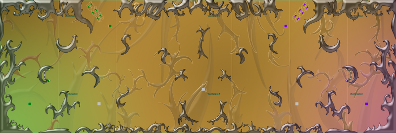
Whew! It took a lot of tweaking, but it's done(ish): Thorns is a ball map, based on... thorns!
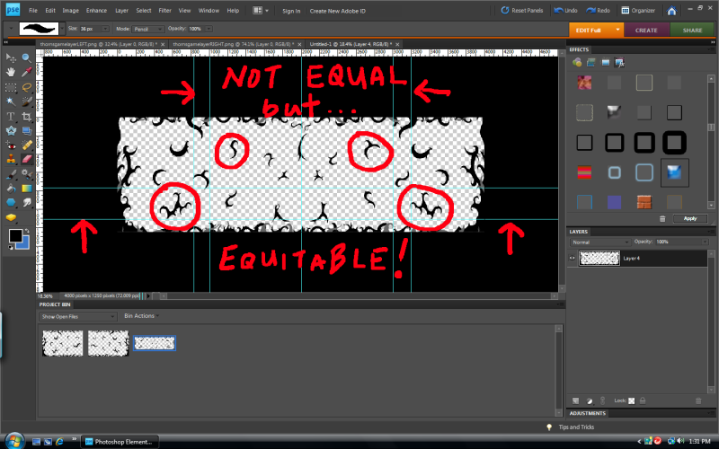
 While not exactly symmetrical, either side has comparative equitable access. I used guide lines to block off map areas (usually 100x100 pixels or so) and then created thorn shapes within those confines. The process is illustrated here:  I should have fixed all the places that a ball might get caught in the thorns. In two cases, I made holes through the geometry to allow a ball to go through some areas, but it's only big enough for a ball, no planes. I also flattened out a few areas on the bottom. I'm waiting to see if it's noticeable at all. In any case, the bots aren't getting caught or lost and I've had no lost balls in skirmish testing so far. I'm working on a new color scheme, but it's time for testing before I sink too much into that. I was getting a stuttering effect, but it was gone for me after I tweaked the parallax. DOWNLOAD MAP: http://www.mediafire.com/file/jiruwz...ll_thorns.altx Comments are welcome and appreciated. Thank you. Enjoy! Last edited by Blind Pilot; 07-17-2010 at 10:05 PM. |
|
#2
|
|||
|
|||
|
Liking the progress on this map!
Just a couple spots that might be potential ball-snaring spots, but this would need to be tested in-game:  Also, what are those little horizontal blue/green bars supposed to be (I circled one in the middle of the map)? They look kinda out of place. Also, regarding the background: Things further off in the background generally are harder to see and thus in less detail than things further into the foreground. You have two layers of background images going on, one that serves as the stems for the ingame objects, and behind that you have stuff purely in the background, but the stuff further back is more detailed than the stuff in front of it. Actually, upon second glance, the stuff in this 'middle layer' is translucent - I can see some of the background thorns rendering through this layer. In my opinion, this 'middle layer' of thorns should get the same level of detail as the background layer, but remain darker or blurred so we know it's in the background. If anything, the stuff farther in the background should look like dull shadows (though I think what you have going on the background is great - don't change it!). |
|
#3
|
|||
|
|||
|
Quote:
Most of the spaces you pointed out have been "fixed" to keep the balls from getting caught (I literally flew around and tried to get it caught, but couldn't. I'm going to keep testing it though. And you're right abut the middle layer.  I need to fix that. I need to fix that.
|
|
#4
|
|||
|
|||
|
Quote:
I fixed it so the middle layer is in front of the background layer. Thank you for pointing that out. It looks so much better. -Also added another invisible ball saver. 
|
|
#5
|
|||
|
|||
|
whoa
that looks badass |
|
#6
|
|||
|
|||
|
Oh that's what you did you sneaky devil :>
|
|
#7
|
|||
|
|||
|
This will be testable on arr #3 within an hour. Looks nice.
|
|
#8
|
|||
|
|||
|
Make it symmetrical already, it's not hard to do and it's the only way you can create a fair map.
It's not equitable (dealing fairly and equally with all concerned) because it's not symmetrical. All offical maps are symmetrical except lost city and that map sucks. Last edited by Boko; 07-13-2010 at 02:38 PM. |
|
#9
|
|||
|
|||
|
Thank you, Gemi.
Quote:
No, it's not hard to do. In fact it's rather easy, comparatively (compared to a non-symmetrical map). I guess equitable is a relevant term.  I'm in education, so when we award degrees, I consider that the students have not had an equal education, but an equitable education (and have been dealt with fairly, and shared equally in opportunities given to them). I'm in education, so when we award degrees, I consider that the students have not had an equal education, but an equitable education (and have been dealt with fairly, and shared equally in opportunities given to them).I guess it's the artist in me that is resistant to symmetry, especially in the case of natural objects (like thorns). But this is 2D planes, where Sky League rules, not the Ivy League! Three people have asked for the same thing so I suppose... I'll create a symmetrical version. 
Last edited by Blind Pilot; 07-13-2010 at 04:11 PM. |
|
#10
|
|||
|
|||
|
i dont think these small symmetry issues can be a big deal, i would keep it as it is (its the map maker's decision). tbd_cave which is one of the most successfull tbd maps is asymmetrycal.
|
|
#11
|
|||
|
|||
|
Asymmetry is fine in my books, as long as it works.
|
|
#12
|
|||
|
|||
|
I like the asymmetry in this map. Looks cool, anyway.
|
|
#13
|
|||
|
|||
|
Just from looking at the picture, I think a small gap in the top middle would open it up a bit. It's kind of weird just having it blocked off like that.
|
|
#14
|
|||
|
|||
|
Actually, Asteroids, Lost City, Asteroids, Cave...
... all asymmetrical, especially in the middle of the maps. |
|
#15
|
|||
|
|||
|
Ya, symetry is just for lazy mapmakers who just want to draw half the map and mirror it in on itself and call it a day.
(<--------- guilty) |
|
#16
|
|||
|
|||
|
Nah- I think it works for man-made structures (like the Core map AND DOODLE SKETCHES!)
|
|
#17
|
|||
|
|||
|
I really, really, love the graphics, the gameplay I'll address as soon as I test it. Is it on arr #3 already?
|
|
#18
|
|||
|
|||
|
|
|
#19
|
|||
|
|||
|
I have it on both Ball Dojos for testing. The first match was 6-0. Hopefully a fluke and not due to one side being easier than another.
 Cool map! |
|
#20
|
|||
|
|||
|
very nostalgic of the old game, because there was an FFA map that resembled this
yay ^_^ |
|
#21
|
|||
|
|||
|
I just tried it out, and I agree with elixir. The middle is too difficult to traverse with the entire top half blocked. Can be fixed by opening a passageway at the top.
|
|
#22
|
|||
|
|||
|
Played it, and it has a lot of bugs in which you can get the ball lost and it being "equitable" is bs. You can never create fair chances for both teams if you don't make it symmetrical. Example:

|
|
#23
|
|||
|
|||
|
Played it a few times over the past couple days and I love it.
Only thing I'd address artistically are the black lines surrounding the thorns themselves. I don't prefer them, but even if you do decide to keep them they look kinda jagged at the moment, which looks weird considering how relatively smooth the thorns look. (Well, as smooth as thorns can get... you know what I mean) I think there should be a feature or plugin for whatever program you're using that will help you automatically smooth those lines out. Like boko said the symmetry is an issue, but I think you only need to pay attention to the thorns immediately surrounding the goal, specifically the two boko pointed out. Have those be symmetrical, but tbh the rest of the map is fine. |
|
#24
|
|||
|
|||
|
im free to test this whenever... can anyone put it up on the FFL or skyleague or every server possible

|
|
#25
|
|||
|
|||
|
Thanks for your interest, evil. I have an updated version that incorporates many of the changes suggested here. I'll update when I get back fgime tomorrow.
|
|
#26
|
|||
|
|||
|
your map is on my server for my clan, =AIR= Ball Server now

|
|
#27
|
|||
|
|||
|
I uploaded ball_thorns to =AIR= EU Server, it's available trough voting.
|
 |
|
|