|
|||||||
| Map Making Discuss everything related to creating new levels here. |
 |
|
|
Thread Tools | Display Modes |
|
#1
 07-23-2010, 03:57 AM
|
|||
|
|||
|
(cue theme music)
(cue theme lulz) It's time for a tetris-themed ball map! Here's an overview of the current version with my usual mock-ups (export screenshot gives me problems):  Notes: - Map is 3011x1511 pixels, but there is a ~20 pixel border running around the entire map, in effect making the playfield 2991x1491. - Team colors are blue and red. - There are four neutral powerups with everything that spawn every 20s. - There is a team-PU for both red and blue that spawns health or a wall every 20s. - Spawns were originally on the bottom, but for this version have been moved to the top. - Saturation of pieces turned down significantly in this version, making the pieces much easier on the eyes. Also darkened a bit. - New, subtler background as opposed to previous versions. - Base background is black. Damage-smoke is gray. Name-indicators are red. An in-game screenshot at normal size:  Currently being hosted at: Ball Dojo #1 - hosting current version 0.5 Ball Dojo #2 - hosting current version 0.5 If you're interested in hosting the test map, post here or pm me to let me know and I'll put your server on the 'Currently being hosted at' list. I need feedback! There's only so much balance one man can do by himself. Let me know your thoughts about how gameplay can be made better! Updated versions will come periodically. Last edited by silent skies; 07-28-2010 at 06:08 PM. Reason: new version; my screenshots suck 
|
|
#2
07-23-2010, 03:58 AM
|
|||
|
|||
|
<<reserved for future use>>
|
|
#4
07-23-2010, 06:13 AM
|
|||
|
|||
|
looks actually quite good but honestly any ball map that has spawns at bottom or below goal just arnt good. so personally id just put the spawns at the top but i cant say a whole lot more till i play it.
the graphics may be to crazy and bright to but again id have to play 
|
|
#6
07-23-2010, 04:01 PM
|
|||
|
|||
|
You should use something like the original tetris borders >>
for your borders also, I'm with hagnot on the background Layout-wise this map looks awesome, can't wait to play it. I'm excited to see how the bottom spawns will work out in a well-designed map. The only tweak I would say is that i would move the blocks right in front of spawns out from spawn a tidge (1 or 2 tetris squares)
|
|
#7
07-23-2010, 04:15 PM
|
|||
|
|||
|
Huh, none of it struck me as very bright at all, but I'll try darkening things considerably in the background. Are the foreground pieces a problem?
|
|
#8
07-23-2010, 04:31 PM
|
|||
|
|||
|
With darkened background and foreground:

|
|
#9
07-23-2010, 04:33 PM
|
|||
|
|||
|
it's just something with the background that I hate. It might be the heavy contrast between the black holes and the lighter background peices.
might look better if there were no black holes? or if the background peices were darker i love the foreground and layout though! edit: this comment was for the first image not the revised one! lol. i like the background darker. not sure about foreground Last edited by shrode; 07-23-2010 at 04:35 PM.
|
|
#10
07-23-2010, 05:28 PM
|
|||
|
|||
|
A quick comparison between brighter (left) and darker (right) foreground pieces, both with the darkened background:

|
|
#12
07-23-2010, 06:54 PM
|
|||
|
|||
|
Reworked a bit. This is with the dark BG and original FG (brighter) colors:
 Spawns are pushed out a bit in this version (two block spaces), and due to some overlooked symmetry issues I had to redesign all the objects on the central vertical line.
|
|
#15
07-23-2010, 09:58 PM
|
|||
|
|||
|
Quote:
|
|
#17
07-23-2010, 10:41 PM
|
|||
|
|||
|
I like this idea a lot.
It definitely looks better with the dark background. But I think you may not even need a structural background, to be honest. In Tetris, the shapes were free falling through a blank, black screen or just across a backdrop of some kind. I'm not saying to have no background, but maybe in this case, less is more.
|
|
#19
07-24-2010, 12:08 AM
|
|||
|
|||
|
Well, if people dislike it enough I might go for a blank black background, or maybe a more complex space one, or maybe just a very large and very dark block tiled over a few times. We'll see.
Anyway, here is a reworked-reworked version, with download. Map File (680kb)  - Spawns reworked to be horizontal, to avoid 'death pit' scenario as much as possible. The spawn points (6 per team) are angled so that all players glide out the opening when spawning (hopefully). - Neutral ball moved farther away from spawns. - Background further darkened - Foreground darkened a little bit, about half as much as the screenshots previously. I felt that in-game they were too bright as-is. - Goal shapes reworked to fit the goals better. - Top 2 powerups moved closer to center. - All powerup spawn times set to 20s.
|
|
#21
07-24-2010, 03:29 AM
|
|||
|
|||
|
Quote:
10char
|
|
#22
07-24-2010, 03:36 AM
|
|||
|
|||
|
Could you darken the bright colors a little bit? It's a bit hard on the eyes right now. Although, that's just a first impression and I'll probably get used to it, just wanted to point that out.
|
|
#24
07-24-2010, 05:13 AM
|
|||
|
|||
|
I'll try further darkening of the foreground pieces in the next version if people are still concerned about it.
Not hosted anywhere atm, but I've pm'd krawz to see if he can get it on Ball Dojo.
|
|
#25
07-24-2010, 05:11 PM
|
|||
|
|||
|
Silent, this map is fun to fly. Take all my suggestions with a grain of salt.
I'm going to stick to my earlier background suggestion and offer the following as well. Per the screenshot below: circles indicate places where you might want to put holes. I can imagine the ball getting caught up in the top part and a whale not wanting to go get it. Also, if someone misses a ball shot and it goes behind the goal, I'm thinking it might be good to let it fall towards the bottom rather than get caught bouncing on the ledge there. I wouldn't get rid of the structures, maybe move them outwards as the arrows indicate. Also, the spawn area might be too tight. It is too tight for some bots, who get caught and crash. That might not be a problem for most people. I tend to crash a lot, being blind and all. Finally I really like the bottom corner structures. That's a sweet set up with a lot of options for flying around/through/over/under. Great job! 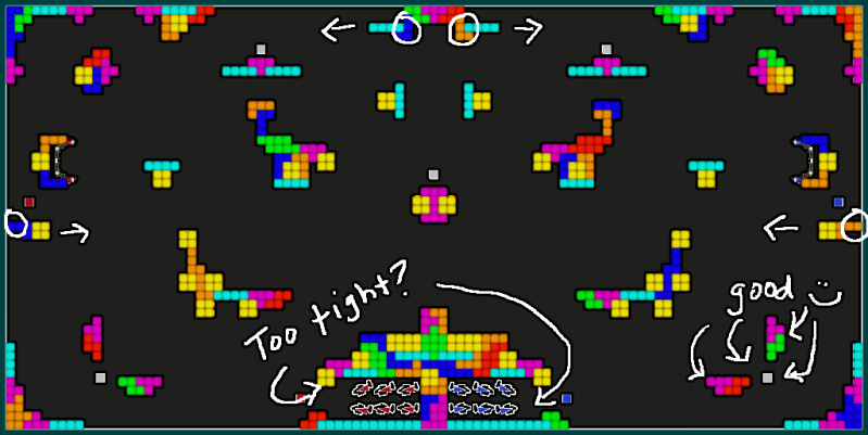
|
|
#26
07-24-2010, 05:46 PM
|
|||
|
|||
|
Good points.
I'll work up something simpler for the background image... large scale tetromino blocks should do it, if they're in dark grayscale... think the block patterns I have in chess atm. I might just fill in the areas at the top, or maybe move the 'wings' backwards and down a bit. I'll put a hole in the behind-the-goal areas, though. For the spawns, I'll try just removing the l (teal) and z/s (red/green) shapes on the bottom, and maybe the square that is jutting out.
|
|
#28
07-24-2010, 07:05 PM
|
|||
|
|||
|
Symmetry issue. The map grid is made up of an odd number of blocks, so in order to fit the symmetry I needed a pattern that had a length consisting of an odd number of blocks as well.
Though I think I can flatten it out again w/ a different pattern.
|
|
#29
07-24-2010, 08:22 PM
|
|||
|
|||
|
Here's what I'm thinking for the next version:
(for some reason I keep leaving in the 'block template' I keep working with and forgetting to delete it, lol. That odd assortment hanging down and left from the center is not in the actual map design, ignore it plz)  - new BG - added old-school border pattern - folded in the side pieces that Blind Pilot mentioned - Filled in the top pieces BP mentioned - Hollowed out the spawn areas a little more. Actual-size screen:  Thoughts? Last edited by silent skies; 07-24-2010 at 11:23 PM. Reason: I am super sloppy with my screenshots xD
|
|
#31
07-26-2010, 06:17 AM
|
|||
|
|||
|
Hmm... what if the goals were just higher, then? Or connected to the ceiling?
|
|
#35
07-26-2010, 08:55 PM
|
|||
|
|||
|
The background is very difficult on my eyes and actually prevents me from forming an opinion on the rest of the map. Just my 2 cents
 I'm interested in seeing the next update though! I'm interested in seeing the next update though!I think I may have an older version? Not sure.
|
|
#36
07-27-2010, 05:20 AM
|
|||
|
|||
|
Shading the blocks darker isn't working... it seems no matter how dark I go, some of the colors still seem, well, kinda bright.
I figure it's because the base colors I was using were too intense to begin with. I'm attempting now not to 'darken' them, but rather to turn the saturation down. This allows the objects to still be 'bright' but takes the sharp edge off of them, hopefully being much easier on the eyes. Screenshot of before/after. Original on the left, lower saturation on the right. Note that the image on the left had already been darkened 2-3 times from the original pieces I had. 
|
|
#37
07-27-2010, 05:41 AM
|
|||
|
|||
|
having spawn on bottom makes for a really fast played map... too fast. The team that wins the first 'push' if you will gains high ground and then its pretty much a goal from there.
Flying up after spawning isn't as fun and doesn't make for as good of gameplay. Love the creativity of the map though
|
|
#38
07-27-2010, 06:39 AM
|
|||
|
|||
|
Well, luckily the map objects are easy enough to shift around w/o having to redo complicated art layers.
Here's a redo with the softer colors (also darkened a bit), and a layout rework. I basically vertically inverted the central column of objects, with the spawns now at the top. The top object was thinned out a bit. Goals were moved down a tiny bit. Neutral ball is right below the object in exact center.  Too tired to do a proper mock-up atm.
|
|
#39
07-27-2010, 08:08 PM
|
|||
|
|||
|
Released v0.5, see first post.
|
|
|
|


 Linear Mode

