|
|||||||
| Map Making Discuss everything related to creating new levels here. |
 |
|
|
Thread Tools | Display Modes |
|
#1
 11-22-2010, 05:55 AM
|
|||
|
|||
|
Hey guys, this is my first altitude map, and i thought i'd get some feedback on it in terms of layout and graphics. Photoshop was used for pretty much everything, and i then just imported it all into the alti editor.
Version 2: (newest) Merry Xmas everyone! I have a present for you. map link: http://www.mediafire.com/?82hghdb0eyk5rsk This is what it looks like in it's current form: 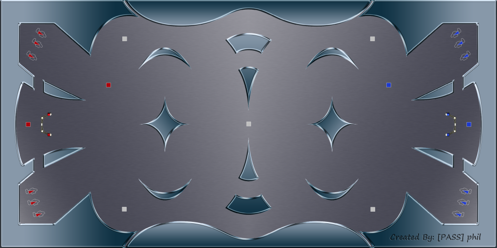 Changes: -improved graphics (no more jagged edges) -goals moved back slightly -tunneled sections at top and bottom middle have been widened -background darkened and made symmetrical Notes: I havn't been able to play this in a server yet, however in the editor it still displays with sections misaligned (see below dashed line) due to some sort of issue with importing the foreground as a large png (tried sprites but it looks too low-res in-game). Again, if anyone knows the cause of this i would really like to fix it (unless it turns out fine in-game on a server). Since i was unable to fix this myself, i've decided to release it anyway, it still plays fine but just looks a bit odd in some places (clear lines where it should be smooth, looks segmented). Enjoy! As always feedback is welcome. --------------------------------------------------- So i've redrawn everything to get rid of those awful edges, and it's looking pretty good now. There is a problem i'm having with the editor though. The way i've made this map is by making it in photoshop, then importing the background and foreground each as large png's in the alti editor. The foreground seems to have become distorted though once imported, as when it is cut up into segments by the importing process, the segments seem to be slightly misaligned in some places, and it really doesn't look very good in-game. For this reason i won't be uploading this version until this issue is sorted, which i'm hoping some of you guys can help me with. Here's an image of what i'm talking about: image: http://i276.photobucket.com/albums/k...apartifact.png Note that the background image doesn't appear to have this problem (although would be hard to notice so it might be there), and version 1 of this map didn't have this issue either. This is probably related to an issue some people seem to have with importing large png's, in which lines are visible at the joins of the segments in-game. If i can't fix this, i will probably just import it all as a sprite and manually draw the collisions, however this seems to reduce the quality of the image so this is not preferable. Here's an image of the whole map for those interested in what it looks like for now: http://i276.photobucket.com/albums/k...screenshot.png Not much has changed, since people seem pretty happy with the current layout, the only real difference is the refined edges of everything, which has also resulted in much sharper corners as opposed to the rounded corners in version 1. This looks fine to me but if people prefer rounded corners i can probably change that easily enough. In terms of look, it's a bit more metal-ish i think (i'm going for a chrome look, with brushed aluminium background), but nothing all that significant since my photoshop skills are fairly limited for now. The background has also been darkened slightly at the request of one poster. Just to clarify the item spawns: behind goals - team only health in front of top spawns - team ball spawns centre - neutral ball spawn four corners - neutral random weapon spawn (no health) **So just to reiterate, i'm asking if anyone knows how to fix this misalignment issue i'm having with the foreground, there are surely map makers on this forum who have experienced a similar issue. Thanks. ------------------------------------------------------------------------------ Version 1: (original post) image link: http://i276.photobucket.com/albums/k...al_v1_Game.png Here's the actual map: http://www.mediafire.com/?2ysdhue63cxdtpy First thing, if the name ball_metal is already in use, let me know and i'll change it, i couldn't find any maps with that name however. Things that need addressing: 1. The jaggedness of all the edges, that should be fixed in the next version. 2. Need to decide on whether to keep the bottom spawns or not depending on feedback. 3. Number of spawns. I've intended this map for 6v6, and to get rid of any disadvantage of bottom spawns, i've limited the number of spawns to 3 in each corner (6 per side). This ensures that in a full 6v6 game, no team will have a top spawn advantage. This can be changed based on feedback. 4. Size of the map. I havn't been able to test this with 12 people, so i want feedback on whether the size is appropriate for 6v6, i'm a little worried it will be too small, but again this can be changed. 5. Proximity of the spawns to the goal area, i've been told they could be too close, however i want more feedback on this. Thanks guys. Last edited by phil443; 12-24-2010 at 02:14 PM. 
|
|
#2
11-22-2010, 06:18 AM
|
|||
|
|||
|
never played a ball map with top and bottom spawns, this could get pretty interesting tactics-wise
I'll add it to the ladder map project, hopefully mikesol will see this thread and upload it to prose only for testing  thanks for contributing!
|
|
#4
11-22-2010, 08:17 AM
|
|||
|
|||
|
Thought you would have taken out the bottom spawns already. IMO its annoying if you spawn low all the time, and it could be good to have that bottom area for the offense to clear it into for territory supremecy.
Love the rebound goals available.
|
|
#5
11-22-2010, 09:12 AM
|
|||
|
|||
|
Quote:
Thanks sunshineduck, would be nice to have some proper testing.
|
|
#7
11-23-2010, 12:04 PM
|
|||
|
|||
|
The map is available through voting on the =AIR= EU Server.
I tested it, although not yet with 6v6. I liked it very much, only doubt I have is about the easy access to the goal from the spawn points making it hard for the attacking team to keep itself near the opponent goal.
|
|
#9
11-24-2010, 12:21 AM
|
|||
|
|||
|
I played a few rounds of this on the AIR server. I am really digging this map. Some quick thoughts:
-There is potential for a lot of great randa play on this map with the open space. In the games i played there was a good balance between some precise passing leading to breakways (with the right combination of killing of course  ), as well as some randa warping interceptions leading to successful counterattacks. ), as well as some randa warping interceptions leading to successful counterattacks. -I noticed that the traffic in this map was well split between the middle and bottom, instead of a majority of cluster****ing happening in the bottom middle which plagues a lot of ball maps. -I need to play it more to form a more solid opinion, but so far from what i have seen the middle layout/obstacles are really enjoyable and the games i played finished in about 10-12 minutes or so which seemed fine.Didn't seem too big or too small. -The little tunnel parts of the map are the right width IMO..You have to be precise going thru them in a whale or you will crash, but smaller planes shouldn't have much problem. Because they are short in length, they aren't as dangerous as the pathways in FunnelPark for example, but still provide a threat from thermos/wall powerups/etc which is nice. -The curved floor and roof and floor of the map are excellent additions, it adds a bit more depth and skill for flying/self passing than compared to a flat surface. -Haven't really seen that much of a noticeable difference in the double spawn points yet, so can't say if this is a good/bad thing. I noticed one time that I was the only plane to spawn in the top location and the rest of my team seemed to spawn bottom, but a few people on my team might not have pressed S yet. I would like to play a few more rounds of this map and focus on how defending/attacking the goal areas for an extended period of time turn out. I'm hoping that with the way the spawn points are setup, it creates an equal opportunity to clear the ball through either the top or bottom path.. I think in most ball maps right now, clearing through the bottom of the map is the safest and preferred choice about 65-75 percent of the time (with a few notable exceptions such as Cave and Grotto). I feel that the current layout of this map doesn't have a predominate pathway to clear out a ball from your goal area, meaning the top part of the map will be used more frequently compared to other maps, which is an excellent thing to have. Great start so far, i really feel like this map has a lot of potential. Keep up the good work 
Last edited by Goose; 11-24-2010 at 12:26 AM.
|
|
#10
11-24-2010, 01:50 AM
|
|||
|
|||
|
Wow thanks heaps for that Goose, good to know it's playing well. Did you play any 6v6 games? That would be a real test of whether the map size is good or not. If you did and it still played well that's a load of work i don't have to redo haha, although if it is too small i might just extend the sides out a bit, which will also allow me to separate the spawns and goals a bit more (if that becomes an issue).
|
|
#11
11-24-2010, 11:45 PM
|
|||
|
|||
|
Yes i played it 6v6 3 times yesterday, and then again twice today 6v6 for 2 rounds. Gameplay still felt excellent when i tested it again, everyone in the server felt it was a good sized map as well. The rounds lasted 9 minutes or so which is about right for most competitive ball matches. The thing i enjoy most about this map so far is most of the action (ie: passing/killing) occurs in the middle rather than get forced down to the very bottom.
phil i think you created an awesome map man, it is a simple yet effective layout, and the combination of the double spawns adds a fun new element to plane ball. I don't have any major complaints or anything, just a few minor suggestions: - The powerup locations are great how they are right now, but i noticed in your original screenshot of the map you posted there are team specific powerups near the goal and a powerup spawn directly in the middle of the map. I don't think i remember seeing these when i played, but the team powerup spawn should be removed, and the middle powerup could be added which would be fun, but the current layout is fine how it is now as well -Some people felt the textures are a bit bland. Maybe make them a bit more metallic looking? And you already said you would fix the jaggedness so i'm looking forward to that
|
|
#12
11-25-2010, 12:14 AM
|
|||
|
|||
|
Cool thanks for the feedback! It's good to know it's working well with 6v6. The team specific powerups behind the goals are health only, should they be removed completely or changed to be neutral powerups (just health or random?)? The one in the middle on the screenshot is just the neutral ball spawn for the start of the match. I thought about having a middle powerup, but it might be a bit odd at the start of the round to have the ball and a powerup overlapping, although i guess i could add a delay timer for the powerup so that doesn't happen, i think that's possible.
Also, something i've only just realised, do you think the team ball spawns should be shifted down to the middle, to give bottom spawners a chance to get the ball if they wish? although they would still have an upward climb so the top spawners would probably always get it regardless. Perhaps this is a good thing as it forces different people to get the ball each time. Regarding the textures, i can have a go at making them a bit more interesting (might as well since i have to redo it all for better edges anyway), but i'm a bit of a novice when it comes to photoshop, still learning all the ins and outs. Anyone else is free to give feedback too, the more the better!
|
|
#13
11-25-2010, 10:16 AM
|
|||
|
|||
|
I think if you move the team ball spawns down to the middle, it will make starting with the ball less of an advantage, as it would take longer to get going (like in ball_star)
|
|
#14
11-25-2010, 11:05 AM
|
|||
|
|||
|
Quote:
As Goose already said, the map is great and only needs minor tweaks, so please don't make major changes. If you feel like making them, maybe you're better making another map with another layout and keep this one as it is.
|
|
#15
11-25-2010, 12:55 PM
|
|||
|
|||
|
Quote:
I'll probably get onto improving the edges tomorrow and maybe trying to make the textures a bit more interesting.
|
|
#16
11-25-2010, 01:14 PM
|
|||
|
|||
|
Yep and i was advocating for NO change anyway just to be clear. Obviously the team who just got scored on should have the advantage with a close ball spawn, and not be at a disadvantage with a far away ball spawn.
|
|
#18
11-25-2010, 03:02 PM
|
|||
|
|||
|
Quote:
|
|
#19
11-25-2010, 11:59 PM
|
|||
|
|||
|
Quote:
|
|
#20
11-26-2010, 04:25 AM
|
|||
|
|||
|
About the ball always spawning at the top. I just thought of something cool but not sure if it could work... Could the team ball spawn location randomly switch between the top and bottom? I think that could be interesting
|
|
#21
11-26-2010, 01:32 PM
|
|||
|
|||
|
Nah you can only have 3 ball spawns total
|
|
#23
12-03-2010, 05:04 AM
|
|||
|
|||
|
Quote:
Also, sometimes the map editor skews things a little bit when you're toying around in the map editor, but it won't necessarily look that way when you've exported the map.
|
|
#25
12-10-2010, 12:50 PM
|
|||
|
|||
|
Quote:
@Zombi: Thanks! I'm not sure tbd would work all that well in this map since it is quite small, however i'll certainly consider it at a later date. I'm mainly a ball player though so making a tbd map isn't really a priority for me, we'll see. Sorry for the infrequent updates, this has sort of turned into a little project i just work on every now and then.
|
|
#26
12-23-2010, 04:56 PM
|
|||
|
|||
|
This map looks awesome and plays nearly as good. I believe the sexy curves are not innocent in both aspects.
Most feedback has been given already but here is one I disagreee with: Quote:
The reason why you want to avoid having tunnels so narrow that people need to count their pixels, is that, in a nutshell, precise flying only goes so far when explosions and EMP are involved. You're not always completely controlling your plane and its course. It's why every area should be designed with those external elements in mind and give some decent room for maneuver. Otherwise, you end up with crashzones people dread flying through and it sucks a huge part of the map's fun. I hope you'll take this into account in your next update, because other than that, this map is nothing but excellent. Wonderful work for a first draw!
|
|
#27
12-24-2010, 02:58 AM
|
|||
|
|||
|
Thanks Sunaku! Regarding the tunnel sections, i can try widening the middle tunnels, however the reason i've made the tunnels near the goals so narrow is so that it's not overly easy for spawning players to save an incoming attack. So the possibility is there for a last ditch ball save, however it will require some careful manoeuvring through that gap at the spawn. This is very similar to the ball_asteroids spawn which i've found works quite well. I may actually move the goal back a bit to emphasise this so that the more difficult route is clearly the shortest route (looking at the map right now the distances seem the same through the gap and around the spawn area to the goal).
I'll hopefully be getting a new version out soon, i havn't been able to fix the issue i've talked about with importing a large png, and using a sprite instead just looks very low res in-game, so i will probably just release it as-is, and maybe someone can figure out what's wrong. I've been experimenting with a new look for the map (same layout still), so at some point i might post 2 versions and ask which one you guys prefer, but next release will look like the image in the op.
|
|
#29
12-24-2010, 12:41 PM
|
|||
|
|||
|
As i've said previously, i was trying to fix that misalignment issue i was having (detailed in the op) before releasing because it doesn't look very nice, but since i havn't been able to fix it i will most likely release it anyway pretty soon.
EDIT: decided to hurry it up a bit and get a christmas release out, see op. Last edited by phil443; 12-24-2010 at 02:16 PM.
|
|
#31
12-30-2010, 01:49 PM
|
|||
|
|||
|
If the current picture is the current layout I recommend making the map wider and moving the spawns up. There has been extensive testing by the developers (or so I have been told) and ball maps work best with a certain width/height.
Here's a quote for you, because nobody ever believes me: Quote:
|
|
#35
03-17-2011, 09:42 AM
|
|||
|
|||
|
Hey guys, it's been ages but it's recently come to my attention that my map has potential to be an official map! (see http://altitudegame.com/forums/showthread.php?t=6116 for a large list of maps being considered for official-ness) However what seems to be holding it back are the bland graphics, and perhaps some minor layout changes.
I'm hoping for some suggestions of how to make this look a bit more interesting, and i'll do my best to try and liven it up a bit, although progress will probably be a bit slow since uni's started again. One idea is to roughen it all up a bit with scratches, scorch marks, that sort of thing. If necessary I can move away from the whole metal theme, I was actually thinking a glassy look could be cool. Of course layout suggestions are still welcome, I haven't forgotten Boko's suggestion of shifting the spawns towards the middle, however I'm unsure if this will screw around with the bottom spawns which people seem to like now (in this thread anyway). If more people think this is a good idea I can probably whip up another version with the shifted spawns. Thanks!
|
|
#36
03-17-2011, 11:17 AM
|
|||
|
|||
|
It's tough getting a map to be official, glad to see your still around looking to improve your map though. I haven't played this for months, but i thought it had a good layout and played fun when i did..I'll try and play some more rounds and give you some thoughts
|
|
#37
03-17-2011, 12:08 PM
|
|||
|
|||
|
Quote:
Like goose, I haven't played this map for quite some time and I don't remember exactly if it was after or before the last update but I recall the images edges to be a little pixelized. About the graphics being bland, I think it comes with the theme. If you keep the map with a brushed metal look, that's not much you can do to make them less bland, I think. On the other hand you may prefer to go with an abandoned metal facility look and add some texture to the graphics, making them look rusty and beaten by the time (example, the mayhem maps), thus getting some maneuvering space to make the graphics more interesting. About the layout, people didn't complain much about it, so you should stick to small changes, like making the map a little (very little ) wider or having some obstacle in front of the goal.
|
|
#38
03-17-2011, 01:16 PM
|
|||
|
|||
|
Yeah I'm not really expecting official map status but serves as a little more incentive to get back on to improving it. I'll probably experiment with the roughened up look as you've said mlopes since I can't really think of what else you would do with a metal themed map, the alternative is going for a different look entirely.
|
|
|
|


 Linear Mode

