Altitude Game: Forums  

Go Back   Altitude Game: Forums > Altitude Support > Map Making
FAQ Community Calendar

Map Making Discuss everything related to creating new levels here.

Reply
 
Thread Tools Display Modes
  #1  
Old 04-26-2011, 12:08 PM
Mandrad Mandrad is offline
Senior Member
 
Join Date: Dec 2009
Location: Lisbon
Posts: 602
Default tbd_metropolis


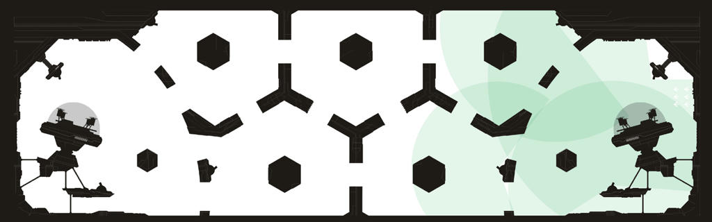
For now, its just a sketch.
This time, i decided for a simpler layout. I think it will be open enough for some fun (although i dont know its size right now).
Ain't decided where, to put the powerups.
Teams will probably be yellow and green and background grayish blue.
Ain't got a name for it...

Hope you like it.

Last edited by Mandrad; 04-26-2011 at 12:53 PM.
Reply With Quote
  #2  
Old 04-26-2011, 12:17 PM
Ribilla Ribilla is offline
Senior Member
 
Join Date: Nov 2010
Location: In ur base, defusin' ur bombs.
Posts: 2,659
Default

I'm a sucker for neutral tones, but actually really like the graphics like that, almost looks dystopian. We'll have to see how it plays, looks like whales may have the run of the map, but then I never was great at judging class balance.
Reply With Quote
  #3  
Old 04-26-2011, 12:27 PM
trendy11one trendy11one is offline
Senior Member
 
Join Date: Jun 2010
Location: Moscow
Posts: 672
Default

Tbh this map needs more free space. There is no middle area to control, 5 rooms with tight corridors. But maybe this is what we need.
Reply With Quote
  #4  
Old 04-26-2011, 12:31 PM
XX1 XX1 is offline
Senior Member
 
Join Date: Mar 2010
Location: Seattle
Posts: 727
Default

Quote:
Originally Posted by trendy11one View Post
Tbh this map needs more free space. There is no middle area to control, 5 rooms with tight corridors. But maybe this is what we need.
Imo tighten the base area a bit, maybe lower base and open up the center a little bit.
Less base camping Please!!
Reply With Quote
  #5  
Old 04-26-2011, 12:51 PM
TwistedDuck TwistedDuck is offline
Senior Member
 
Join Date: Nov 2010
Location: Randa Mechanics™
Posts: 635
Default

its a nice map i like base inside ufo's i think the middle portion is too cramped (too tight) op for whales

anyway looks good

keep them maps commin!
Reply With Quote
  #6  
Old 04-26-2011, 01:34 PM
Mt.Vesuvius Mt.Vesuvius is offline
Senior Member
 
Join Date: Jan 2010
Location: If anyone asks, Tmic isnt my pimp..
Posts: 2,475
Default

tbd_probing_park imo
Reply With Quote
  #7  
Old 04-26-2011, 05:35 PM
wolf'j'max wolf'j'max is offline
Senior Member
 
Join Date: Jul 2009
Posts: 3,846
Default

more free space indeed, and for some reason the shapes remind of well.. everything reminds me of the game 'portal' so, tbd_portalpark anyone?

Last edited by wolf'j'max; 04-26-2011 at 06:58 PM.
Reply With Quote
  #8  
Old 04-26-2011, 05:54 PM
Demuyt Demuyt is offline
Super Moderator
 
Join Date: Jun 2009
Location: Bath, UK
Posts: 3,427
Send a message via Skype™ to Demuyt
Default

Really like the map. The shapes are hexagons, therefore I name this tbd_hexpark

By the way I miss ffa_hex so much, when is someone going to host that
Reply With Quote
  #9  
Old 04-27-2011, 08:39 PM
sunshineduck sunshineduck is offline
Senior Member
 
Join Date: Dec 2009
Location: They were naked, I saw many pussy, I walked away. Call me gay but just saying.
Posts: 4,057
Default

pure white as a background would probably be too bright.
Reply With Quote
  #10  
Old 04-27-2011, 10:43 PM
XX1 XX1 is offline
Senior Member
 
Join Date: Mar 2010
Location: Seattle
Posts: 727
Default

Quote:
Originally Posted by sunshineduck View Post
pure white as a background would probably be too bright.
herp
oh, mandrad said that it was just a sketch for now (and background grayish blue)
Reply With Quote
  #11  
Old 04-27-2011, 10:45 PM
leggomyeggo leggomyeggo is offline
Senior Member
 
Join Date: Sep 2009
Location: http://24.media.tumblr.com/tumblr_l76jo1xRKb1qbe82eo1_500.jpg
Posts: 2,678
Default

Quote:
Originally Posted by Mandrad View Post
background grayish blue
Quote:
Originally Posted by sunshineduck View Post
pure white as a background would probably be too bright.
Not pure white, a grayish blue.


Edit: Ninja'd, fuuuu xx2
Reply With Quote
  #12  
Old 04-29-2011, 08:12 PM
Mandrad Mandrad is offline
Senior Member
 
Join Date: Dec 2009
Location: Lisbon
Posts: 602
Default

Tx everybody for the feedback.
I made slight transformations since the 1st sketch.

Im naming it Metropolis (no park). If a Mod could please change this thread name tx guys

Hope i can put it today in the Maptest server (trying...).

Here it is

Please test. I have some ideas concerning improvement but i want to hear it from you guys.
Reply With Quote
  #13  
Old 05-04-2011, 10:31 AM
Mandrad Mandrad is offline
Senior Member
 
Join Date: Dec 2009
Location: Lisbon
Posts: 602
Default

Didnt had much feedback so... Im going to make the objects thiner and remove the "island" in front of the base.
Also gona put the base "5" pixels higher.
Mods, please make the thread name tbd_metropolis. Tx and sry
_______________________________

EDIT: Map was updated on MapTest Server
Link
_______________________________

Last edited by Mandrad; 05-04-2011 at 03:52 PM.
Reply With Quote
  #14  
Old 05-06-2011, 03:49 PM
Mandrad Mandrad is offline
Senior Member
 
Join Date: Dec 2009
Location: Lisbon
Posts: 602
Default

I usualy bring up a music with every new map,
almost forgot it this time...

Here it is, sexy

PS. tx mods for name correction
Reply With Quote
  #15  
Old 05-07-2011, 01:40 AM
Nikon Nikon is offline
Senior Member
 
Join Date: Dec 2009
Location: ball_grotto
Posts: 1,239
Default

The graphical sketch looks awesome! You always have awesome looking maps, I'm jealous.
Reply With Quote
  #16  
Old 05-07-2011, 01:11 PM
A Nipple A Nipple is offline
Senior Member
 
Join Date: Aug 2009
Location: with bongs gf! <3
Posts: 982
Default

looks good graphically, love the ufo base's. The middle need reworking. Can't offer any ideas atm but if any come to mind will post em. p.s the background shud be skyscrapers like tronesque!!! =]
Reply With Quote
  #17  
Old 05-20-2011, 11:59 AM
Mandrad Mandrad is offline
Senior Member
 
Join Date: Dec 2009
Location: Lisbon
Posts: 602
Default

Let there be light! Or darkness...
Feedback feeds the makers.
Reply With Quote
  #18  
Old 05-21-2011, 06:28 PM
elxir elxir is offline
Senior Member
 
Join Date: Feb 2010
Location: All-American
Posts: 2,687
Default

you've outdone yourself...the map looks awesome

i can't offer much in the way of gameplay because 2v2 with 3 bots is not very telling...

p.s. the download is currently 4.0 mb :O

Last edited by elxir; 05-21-2011 at 06:44 PM.
Reply With Quote
  #19  
Old 05-30-2011, 06:10 PM
elxir elxir is offline
Senior Member
 
Join Date: Feb 2010
Location: All-American
Posts: 2,687
Default

played a match in ladder

people's comments were essentially: 1) why is the base so high? and 2) download is WAY too big (about double the size of the next largest map)
Reply With Quote
Reply


Posting Rules
You may not post new threads
You may not post replies
You may not post attachments
You may not edit your posts

BB code is On
Smilies are On
[IMG] code is On
HTML code is Off

Forum Jump


All times are GMT. The time now is 06:04 AM.


Powered by vBulletin® Version 3.8.2
Copyright ©2000 - 2021, Jelsoft Enterprises Ltd.
2008 Nimbly Games LLC